[IMPLEMENTED] Design modernization

Usually I am not a big fan of redesigns, because it is just a lot of effort and does not provide a lot of value. But I would like to improve a few things around navigation to be ready for a future responsive design and a modernize the UI a little bit.

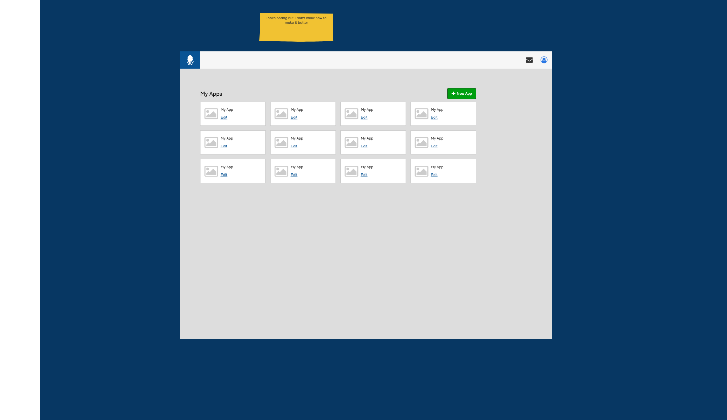
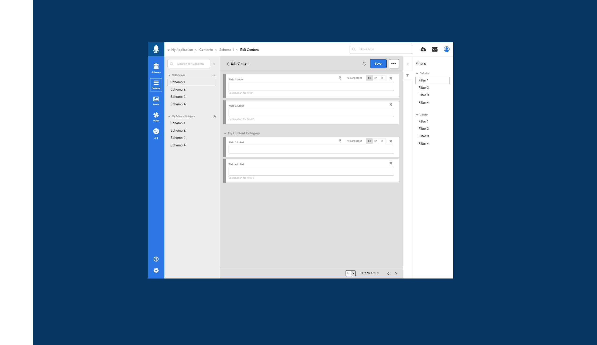
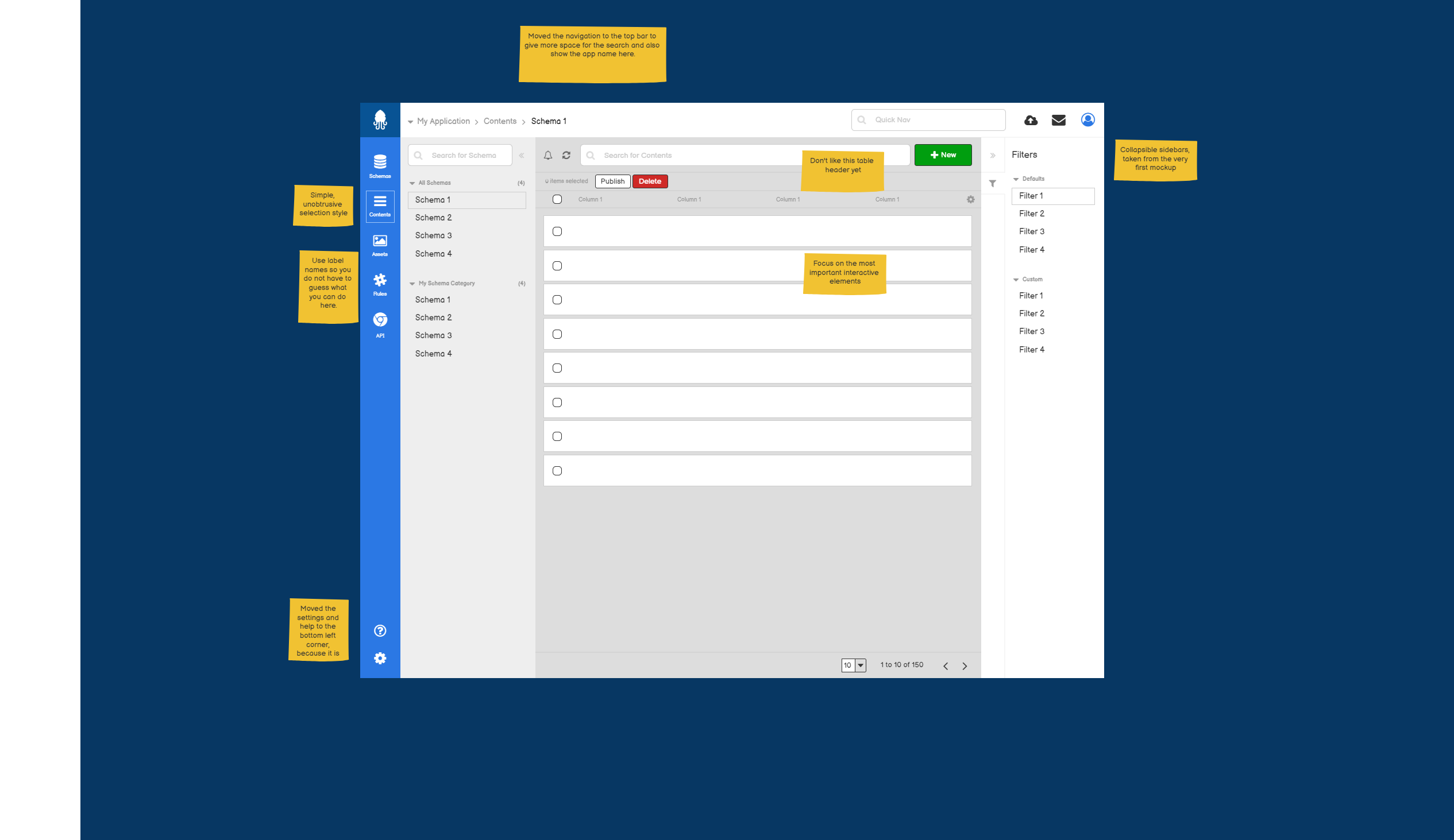
In this topic you can see a few low fidelity mockups. The goal is to freshen the design a little bit without changing too much and spending too much effort into it.

Your feedback is very welcome. If you have topics you would like to see changed, please don’t hold back.

The icons are just placeholders.

Feedback:

1 Like

I have added more designs to an invision board. You can also leave your comments there.

https://projects.invisionapp.com/boards/7340TY2VCAJ/

I have also implemented a prototype:

It looks rubbish, but it is a more a prototype and an analysis how long it would take to implement that. The actual estimation is around 2 weeks when the theme itself is ready. But this is something for a professional designer.

1 Like

Hello, I do not want to create a new thread because it may fit this feature concept (feel free to remove it if not).

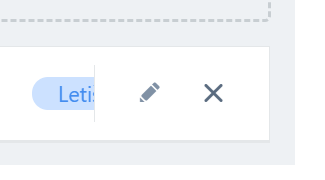
During content editing, we are too often face accidentally removing reference, when we want to actually edit it.

image

Hover
image

It may be, better to switch the order of icons as fast fix (because if it is accidentally clicking to edit it, closing the new tab is faster than re-assign the reference).

And by the way, refreshed UI looks nicer!

Close or delete is always on the right side. But the close button has a confirm dialog now…

1 Like

Hi,

the screen designs for design modernization are available here: https://projects.invisionapp.com/share/YVZWRXTKCR8

Feedback is very welcome.

1 Like

WOW looks nice!

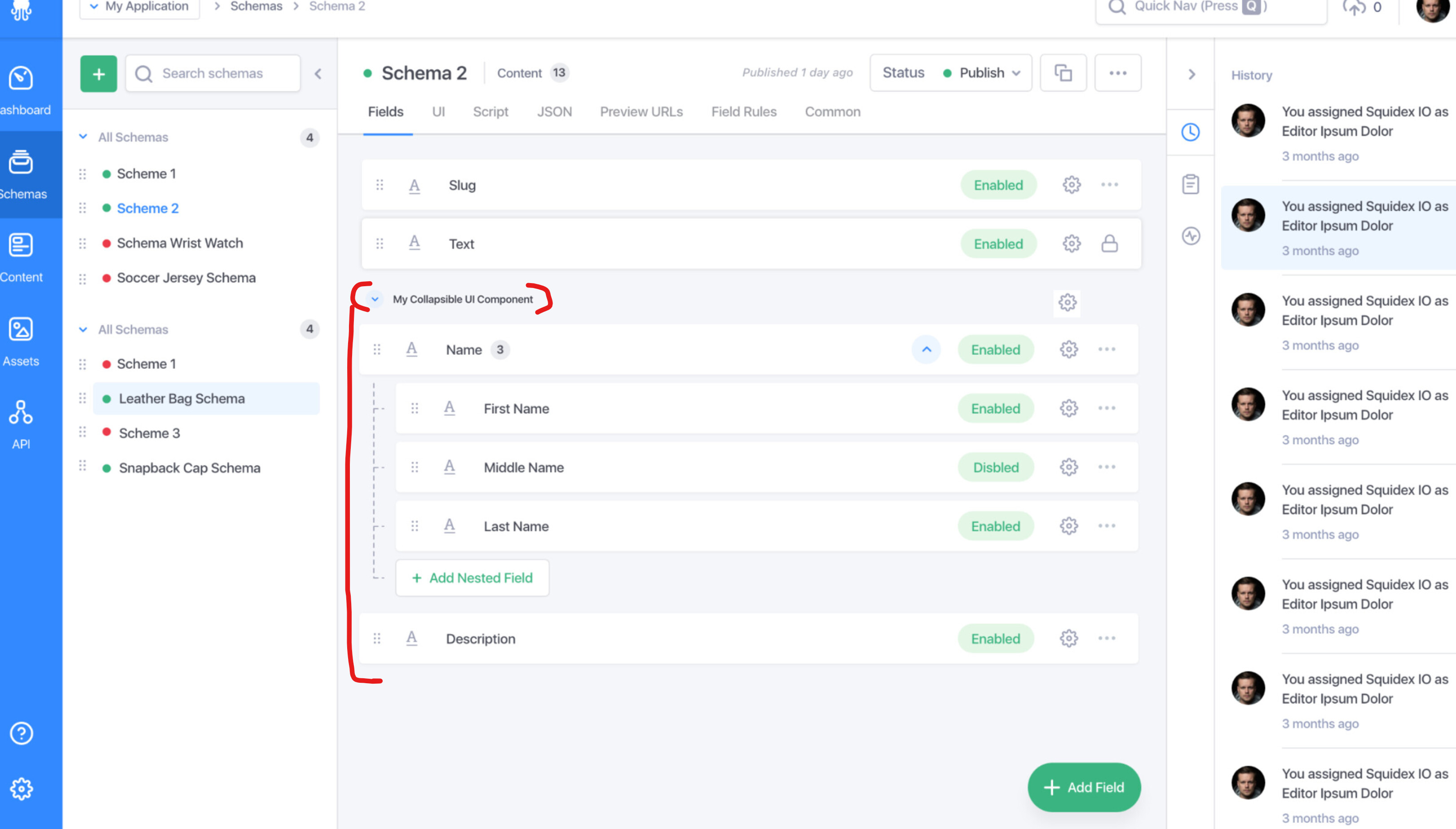
I really like option for collapsing nested field in scheme page. From screens i do not notice if same will be apply for “UI separator”. It would be nice to (and if it can look more like it is look in new content prototype page even in scheme page it will be even better, currently it help just in content page, but in scheme editor not so much).

I already like squidex UI, it looks nice, but this lift the bar even more.

I understand what you mean, but I would actually like to change the schemas a little bit. The current problem is ordering of fields and that groups are managed with separators. What I would like to do is to have a separate config for the structure of fields for the UI, e.g. the json representation could be:

tabs:[{
   "name": "common",
   "label": { 
    "en": "Common"
   },
   "sections": [{
     "name": "section1",
     "label": { 
      "en": "Section1"
     },
     "fields": [
       "slug",
       "name"
     ]
   }, {
     "name": "section2",
     "label": { 
      "en": "Section2"
     },
     "fields": [
       "slug",
       "name"
     ]
   }]
]

This would make your problem unsolvable. Unfortunately I don’t know how to apply it to array fields yet.

I agree ui section should be threat differently from another field (in the end it already does, because it wasn’t visible in api). I do not think it collide with my proposal; I care about option to collapse UI section in scheme design in portal. Currently this option is available just in “content” section.

This is for raw illustration what I mean.

For array fields isn’t possible to add filed with sections too. Like this? Or I missing something.

{
  "name": "arrayItems",
  "properties": {
    "fieldType": "Array"
  },
  "partitioning": "invariant",
  "nested": [
      {
          "name": "name1"
      },
      {
          "name": "name2"
      }
    ],
  "sections": [{
     "name": "section1",
     "label": { 
      "en": "Section1"
     },
     "fields": [
       "name1",
       "name2"
     ]
   }, {
     "name": "section2",
     "label": { 
      "en": "Section2"
     },
     "fields": [
       "name1",
       "name2"
     ]
   }]
}

With Array field i have, also small issue with, partitioning, even if I want translation just for one field i am force to mark as translated all field (or any). But this isn’t related to UI modernization

Perhaps I don’t understand what you mean with collapsible sections. The left menu and the right sidebar can always be hidden.

I mean this.

Block of the fields in “Schemes” in the portal. This “block” can be collapse in “Content” editor (view,edit,add). But not during editing schema.

Lol, I have not seen it in your first screenshot. My idea was to separate the technical schema from the UI but then this would not be possible.

Wow! This is a significant upgrade. Well done!

Agree that the UI separator can be a bit different hinting that it’s not going to look like a field (or at all). It’s a nice to have, not a must.

The updated UI is clean and organized, I’m a fan.

1 Like

Looks good Sebastian!

Do you also plan to make it as responsive as possible or is that not profitable enough (like the time to create it and the value it creates)?

Not for now, the value is too low. I asked a few big customers but nobody wanted to invest in it.

1 Like

How are things going with the modernization?

Hi,

The design is done, but a few months ago I hired an agency to make the theme based on bootstrap and last week I cancelled the project because the result was too bad. So I have to make it myself now, I guess.

A lot of things around navigation and so on are also done, so the last thing is to make the template and then apply it.

That sucks!

But you had a great design right, or were that too complicated?

Im not sure if you use Figma but otherwise you can use this: “https://www.figma.com/community/file/876022745968684318”. With that you can use the bootstrap components in Figma to design the template.

I think they are not used to that kind of work. They build websites for CMS systems where it is okay to make hacks, but I need first class CSS code for the long term.

A first version is available as dev-6150 … I will make more fixes and improvements over the week and then release it as 5.9.0 end of the ween I hope.

If you want to test it out, your feedback and bug reports would be very welcome.