I have…
- [N/A] Checked the logs and have uploaded a log file and provided a link because I found something suspicious there. Please do not post the log file in the topic because very often something important is missing.
I’m submitting a…
- [x] Regression (a behavior that stopped working in a new release)
- [ ] Bug report
- [ ] Performance issue
- [ ] Documentation issue or request
Current behavior
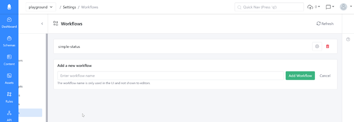
Workflows page main panel is larger than on other settings pages, causing it to scroll to the right and making the list of settings not as visible:
Expected behavior
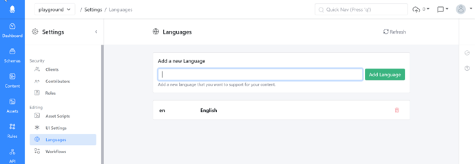
Should appear the same as other pages on first load, for example:
Minimal reproduction of the problem
Navigate to the Workflows page.
Environment
- [x] Self hosted with docker
- [ ] Self hosted with IIS
- [ ] Self hosted with other version
- [ ] Cloud version
Version: “Half width array and component fields.” (f4f6f778c49d413595e6a122b0460586d59d1659)
Browser:
- [x] Chrome (desktop)
- [ ] Chrome (Android)
- [ ] Chrome (iOS)
- [ ] Firefox
- [ ] Safari (desktop)
- [ ] Safari (iOS)
- [ ] IE
- [ ] Edge
Others:
This is obviously not a critical bug and may even be deliberate to provide more space for the workflows? Just felt jarring for me when quickly going through the various settings pages as the next setting I was going to click was no longer in the same place.

