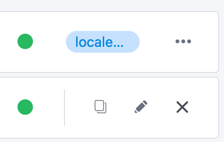
In a reference list, when a user mouses over the ellipsis on a list item, three buttons are presented:
[OPEN] [EDIT] [DELETE]
The “Open” button is the most useful because it will open in a modal without requiring a new window.
The “Delete” button is the least useful, as this will rarely be the desired action and is prone to misclicking. The misclicking issue is because this button appears immediately after you mouse over the ellipsis, replacing the ellipsis, making it very easy to click instead of mouse over and accidentally click on the delete button. This issue is compounded when the user selects ‘do not remind me again’ on the confirmation modal so that the item is automatically deleted on click.
My suggestion is to change the order of the buttons to:
[DELETE] [EDIT] [OPEN]
This would make the default action open, and as a result the UI would be more usable.
I understand your desire for consistency, but in this instance it’s causing a significant usability problem in the UI
If you’re dead-set on not changing the order of the buttons, another solution could be to remove the ellipsis entirely, so that the three buttons are shown at all times. This would also solve the issue of overly promoting the delete action in scenarios where it is not desired. Changing the mouse-over into a click cloud be another option to improve the experience.
The goal of the ellipsis here is to protect the delete action by forcing the user to perform an additional action first, in this implementation that additional action is a mouse-over. If the action were instead click, it would help the situation but still wouldn’t solve it because there are many users that will double click by mistake, but this is still a large improvement over the action being a mouse over since the button would only change on a click action, making the experience more intuitive and reliable. Because the goal of the ellipsis is not being met in this implementation, shouldn’t it be changed or removed?
NOTE: I expect this implementation would also have issues with other input devices, such as pointer devices or tap input, that have a difficulty with mouse over actions.
No, the goal was to save as much space as possible. At the beginning there was only the remove button. Some users have multiple columns here to show and if you compare versions and show different content versions side by side the space is even more precious.
It could also be changed to a normal dropdown like everywhere else.
oh yeah, a drop down work as well. it’s not as elegant, but it works.
yeah it can be tough to try and fit a lot of UI into a tight space, I’ve come across this problem many times with my work.
I’ve seen other applications handle this by removing all actions from the list items, and replacing this with a single multi-select box on the list items, and the actions are at the top of the table in a drop-down that apply to all selected items.