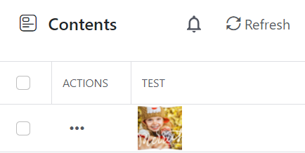
Run into problem managing multiple images of the same variety with the preview function for list and reference fields. We are trying to use squidex for a template system, and often times a template can have multiple variants.
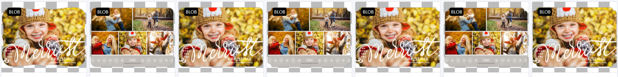
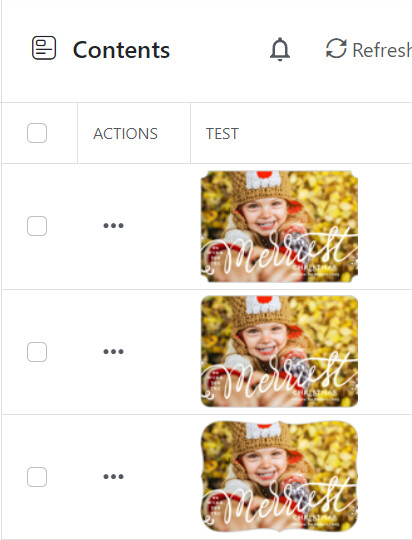
Below is an example of assets for a specific group we have (and we have several thousand like this in different groups for cards).
If you look at the same front image with the child you’ll see that the edges have different designs. Currently with Squidex, when I add an asset to the schema and resolve the first asset, I get a small square preview.
It would be great if we could have control over two items…
Right now the image asset is called with a default width and height, so the image is always a square preview of the center. For most preview assets I actually only care about the height, and want the width to be 100% of the image. This presents a problem for very wide images that are not tall, which we have none of, but I thought I would point out aspect ratio could matter here.
While the preview row height for the List and Reference/Component UI is normally pretty good, occasionally it makes sense to want each row to be taller to see more detail of a asset preview. The asset preview could be the key UX clue to the user that this is the field they want to work with.
Not sure if it would be possible to create a solution for this problem, it would be a huge help to our system, and I imagine would be popular for many other customers doing asset previews in their list / references. Having said that, I think what you have as the default is also great for most use cases.
Not sure what would be best solution here. You could let us specify a width/height for an asset preview and if its set use that over the default 50px. It would also help control the row size of the preview in list/reference. If height was specified and width was not, width would just be 100%, etc. By default they might just show a input hint of 50px since that is default…
The main suggestion I’m making is to allow the image asset being previewed in the rows for content lists and reference lists to be a full image. In addition it would be great to set a height on the image so the row could be larger to see the details of that image. Finally if no width was set the full image would show, instead of a 50x50 square.
I have several templates, sometimes the variant difference can be the color of the card paper, the color of a font in the middle, physical foil on a card, or the template could be vertically tall instead of wide like the examples given earlier.
If there was an easy way to define just a height for the asset preview and the entire image showed in the row that would be perfect. It would allow for entire previews to be shown, not just a small focal point, etc.
Hope that helps.
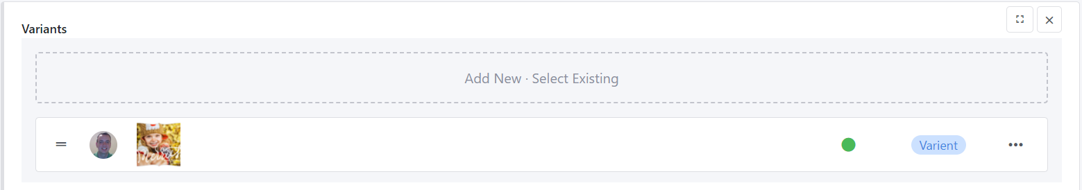
I tried the focus point suggestion. This appears to work (not locally, but in the cloud version, we probably need to run an update to fix local). The main problems I see with this as the solution is…
a) The user would have to set the focal point each time they upload, which I think would not work.
b) As I mentioned above its not always related to the edge, it can be numerous other things that would make seeing the entire preview more beneficial.
c) We are making an importer to move away from an old system, this would need to set the focus point as well. I could be mistaken here, but I don’t believe I can set this in the API.
If we could control the query string of the asset it would solve 80% of issue. The only thing is the row height itself wouldn’t adjust to the height of the image so it would still fit in 50px height, which can be good/bad depending on detail needed to see.
I agree with complexity, I’m not sure there is easy solution other than maybe having a mode option that provided a set of options for preview and that was it. So 50x50 would be Small, 100x100 could be Large, etc. This would solve row issue, but wouldn’t solve box issue of image being full width.
Maybe no good solution here.
This could be good, but it forces the user to take additional mouse action to really see previews. In addition, I’m slightly worried it may have ramifications we aren’t considering in content it covers, etc.
Thanks, missed this.
Will look at again later. Maybe I did something weird, or maybe it has to do with assets imported, not sure. I’ll dig deeper as soon as I have a chance.
Ultimately, it would be awesome to have a solution for this on the preview (will make this work as good/better than their original completely custom tool.). If it is too big issue though in terms of obscure usage or complexity, I completely understand if we need to consider alternative solutions on our end beyond using the asset as the key identifier.
If hover was implemented, and there was way to have preview image be entire image at max height 50, that would be a near 100% solution.
While preview would be smaller, in a lot of cases, basic detail could be seen. Seeing close up detail would definitely be better in a hover as image could be bigger. Wouldn’t be perfect solution, but I could see how both the image hover would be useful to a wider group of squidex customers, and full width image would also be useful.
Not sure what you mean. The current size of previews is 50x50. The size I gave in the example was 90px high, but that could easily just be 100px.
The templates themselves have various sizes, and are inconsistent, but can be rather large images. If we did hover, it should still have some max-height I’m thinking and not be full size.
Sorry for the late reply, missed this notification earlier. I think that would work. When I was testing our templates, in particular it seemed like a larger row height was needed to see detail, which is why I ended up doing the 90px per row.
Maybe it would make sense to increase the row height on this slightly as well, but only when an image preview was added to the list of displayable fields. There is no perfect though, no matter what height you do, at some point details will be missing with smaller preview.
Having said all of that I think this is very helpful.
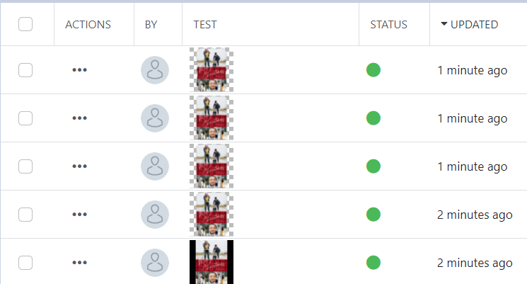
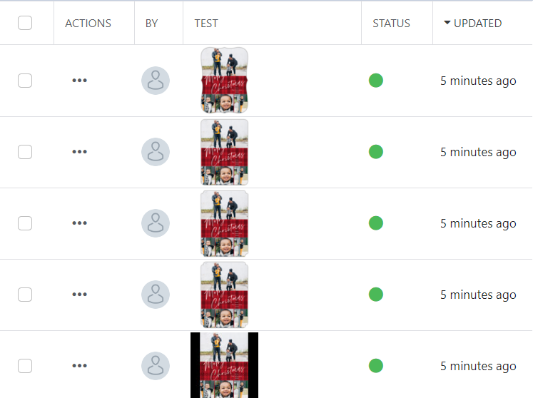
As you can see, its difficult to tell the difference between any image. In addition the last image has a black background. This is because of the extra padding, the image itself is just the rectangle you see that is not black.
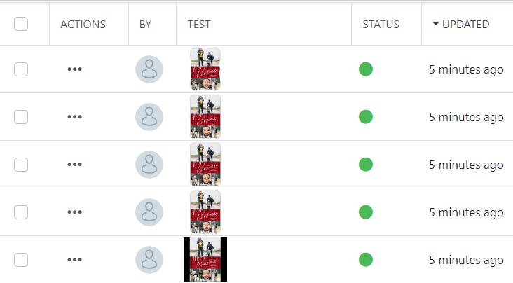
If the bg parameter is set on the asset url to bg=white, it would then look like this…
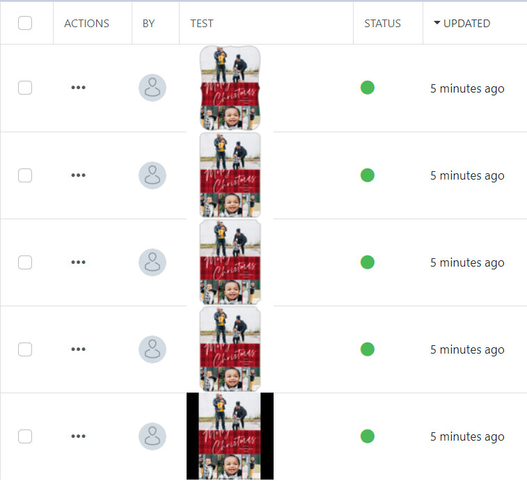
In this situation, the templates are slightly clearer of a difference, but small differences are difficult to see. In addition the black background is still a problem in the mode=Pad on the jpg image.
None are perfect, but as the height increases some of the smaller details are a little clearer.
Here is what I would suggest for changes.
set the bg param to make the smaller preview clearer. I set bg=white
use the bg param to set color on mode=Pad so a jpg that is fit doesn’t add an unexpected color.
increase the row size when an asset image preview shows in the contents/reference list. This will give larger clearer preview, although not always be perfect.
In case the second bullet point is confusing… here was my original template image.