I have not checked the logs, it is working but it is showing that data in the wrong place.
I’m submitting a…
- [ ] Regression (a behavior that stopped working in a new release)
- [ X ] Bug report
- [ ] Performance issue
- [ ] Documentation issue or request
Current behavior
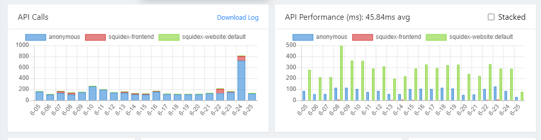
It is always there. So on the Dashboard under the title ‘API Calls’ it shows the chart of the ‘API Performance’ and under the title ‘API Performance’ it shows the chart of the ‘API Calls’
Expected behavior
Whould like to see that the correct chart is below the correct title.
Minimal reproduction of the problem
Go to the dashboard
Environment
- [ ] Self hosted with docker
- [ ] Self hosted with IIS
- [ ] Self hosted with other version
- [ X ] Cloud version
Version: Current cloud version
Browser:
- [ X ] Chrome (desktop)
- [ ] Chrome (Android)
- [ ] Chrome (iOS)
- [ ] Firefox
- [ ] Safari (desktop)
- [ ] Safari (iOS)
- [ ] IE
- [ ] Edge
Others: